Showing posts with label inspiration. Show all posts

Wednesday, January 30, 2013

Sparkle


TITLE: Sparkle
MEDIA: Ink, gouache


A little bit of sparkle + soft, comfy loafers to liven up the grey :) the silver ink picks up in the light nicely.

Sunday, January 13, 2013

You Are The Map Maker: Posters


Remember this post about the book you have to read? Well the same collaboration - UK design studio Believe in and Australian author/blogger Bernadette Jiwa - have produced some great typographic posters. Available here.

Monday, August 20, 2012

Hands on craft.


Building on yesterday's long post, I found this article on desktop magazine reiterate what I have found most valuable working in my current job, and also something that I have always felt;- that designing something 'hands on' is always the most rewarding. 

Veronica Grow from 'The New School for Design & Typography' writes:

"When we get the chance to incorporate a hand drawn illustration or work with a piece of paper and a pair of scissors, we really enjoy it. Working with our hands is a uniquely engaging human experience that comes from being both creatively and physically active, when a powerful nexus emerges between hands, head and heart, leading to the building of tacit or embodied knowledge."

Spending 95% of my time on the computer is not how I wanted to spend my time designing - and I'm sure for most of you, isn't what we signed up for when we said we would be designers. So let's pick up a pencil, fine liner, brush, whatever - and make something that is unique, something that has personality and shouts creativity from the top of your lungs.

Beautiful hand drawn type, 1, 2.


Wednesday, November 16, 2011

Erratic nature


Sibella Court is one of those people that can chuck a few things together, in a sporadic fashion, and suddenly make those items look like a piece of art.

I love the way she's styled her current exhibition 'Etcetera etc' (previously blogged about) at the Barometer Gallery - memorabilia dangle from twine and bulldog clips, photographs are tacked on with masking tape crosses, kraft paper hangs from the ceiling and breaks up the background, vintage frames sit on stools…

Her book feels like opening up a trove of treasure - there are so many things to discover, so many little details, not at all laid out in the neatest fashion, but instead brimming with charisma, individuality and life.

I'm writing this looking at the exhibition photos on her website - wishing I could go see it and take photos for myself. (So If you're in Sydney go check it out, details here.)

On another note, I've just finished up an Interior Styling short course, and although I enjoyed playing with textures, shapes, forms and design principles in a three-dimensional space, I found that the teacher and other students were often preoccupied with being neat and making sure everything matched to the T, in essence recreating a display home. I don't quite agree with this - I think it's great to be 'perfect' sometimes, but it can also be very stifling to creativity. This is what Sibella's work shows me - that sometimes you just have to let loose.

Monday, November 07, 2011

Poetic Sensibility


There is something I find so alluring about Matt Wisniewski's collages. 

The harmony between humans and landscape, proportion of shape and space, balance of emotions and silence, juxtaposition of soft and hard, mixture of movement and stillness, contrast of shallowness and depth... creating a lyrical and poetic sensibility to each work.

I could get lost in my imagination staring at one of these.

Tuesday, October 04, 2011

Own a colour and help save a child's life


The idea behind this is so simple and brilliant - your average computer/phone/ipad can display 16.7 million colours. Unicef wants you name each colour by donating at least 1 pound for the ownership of a colour, which goes directly to help transform children's lives.

I've already picked one (spent too long browsing through the different variations of salmon pink!) and named it 'Blushing Really Bright'. It's a beautiful, simple and interactive website - you'll be excited if you're a designer!

I think I'm going to buy more now..check it out here.

Thursday, September 29, 2011

Sue Blackwell


Is taking paper art to a whole new level, creating fantastic sculptures relating to the stories in the books. Imagine opening a pop up book with these sculptures telling the story...
See more of her wonderful work here.

Thursday, September 15, 2011

Katelyn Mooney


These soft, playful and naive images are wonderfully styled by Katelyn Mooney, a designer turned stylist who graduated from Parsons in New York. 

She'll be contributing to the next issue of Papier Mache magazine... can't wait!


Sunday, September 04, 2011

Wednesday, August 24, 2011

You Are The Map Maker


This is one of the best books I've read all year, and I am so excited to share this with you.

'You Are The Map Maker' is a project by Bernadette Jiwa, bringing together insights from 13 of the most creative and resourceful entrepreneurs on the planet. Jessica Hische, David Airey, Mark Bloom and Chris Guillebeau are just some of the creatives who have contributed their stories and their advice.

Starting up littlemiso and working as a freelance designer is one of my happiest achievements, but the reality is that it is not easy at all - and sometimes the smallest hurdle is enough to fill you with self doubt and slowly etch away your confidence to be a 'creative'. How many times have I started a project and not gone through with it because I didn't think it would work? Or even worse - I can't even count how many times I've had an idea in my head and thought it was brilliant, but never made it into a reality because of that tiny inkling of self doubt that eats away at my confidence. (Is it really worth spending $X on it? Is it really worth all that time?)

Reading these insights from successful creatives is a reminder that every hurdle I have been through or am going through is exactly what they have experienced through their journey - and through honesty, self reflection and persistence - they have gotten through to where they are now. Sounds like common sense, but when you're in these situations - it's the best type of advice you can get…and it's DESIGN related.

Working in a creative field is always going to be different in a bank or engineering firm. This book is filled with advice from designers we look up to, have the same mindset and similar likes and dislikes.

Now enough love for the book - just GO READ IT. For FREE.


Wednesday, August 10, 2011

Handwritten letters

I love messages behind projects - and this one applies to all of us. Craig Oldham writes, "There is always something nice about receiving a letter. Especially today when the way we communicate is governed by a text or a tweet, the ping of an email or a social network poke, leaving many to lose sight of the things that have been around for a while - like pen and paper."

So he started the Hand Written Letter Project, inviting designers and creatives to share their thoughts with a handwritten letter on their own letterhead. Milton Glasner, Wally Olins, Bob Gill, Vince Frost are just some of the 100 that have responded, and now the letters have been converted into a book and will be exhibited at KK Outlet in London.

Isn't it funny that letter writing has become so abnormal that it's treated like art now and displayed in galleries? Either way, it's great that letter writing is getting more exposure - it's definitely something I miss.

TITLE: Envelopes
MEDIA: pen, ink, watercolour
Little pouches that contain those special messages.


Tuesday, August 09, 2011

THIS is it


It's perfect. Loads of light, white, wood, neutrals and just the right amount of whimsy. (Stacked magazines to make a coffee table, masking tape rug...) Object collected from different places around the world bringing memories, photos/magazine clippings bringing inspiration. Look at that painted park bench in picture 3...isn't it just right?

Photographed by Philip Karlberg, styled by Nanna Lagerman for Elle Interior.


Thursday, June 23, 2011

Tanya Ling


Tanya Ling's fashion illustrations have always been an inspiration for me - they remind me that illustrations don't have to be a photorealistic portrayal of the subject, and that the emotion in a drawing says so much more.

The fluidity, boldness of the strokes she uses breathes a different quality to fashion that photographs just can't achieve. I had the pleasure of seeing her original works at Fashion Illustration Gallery (FIG), and it's even more amazing in real life because you can see exactly where the brush was, and all the detail of the paints and inks mixing.

See her work online here.


Tuesday, May 31, 2011


a paper hummingbird, so fragile and delicate. 
seen here.

Friday, May 20, 2011

Robert Montgomery


makes art by filling empty billboards, adshels and walls with his words. it's funny how i would actually stop and read these passages - even though they are so much longer than advertisements - but not take more than a second to look at an ad. 

more here via here.

Thursday, April 28, 2011

Mixed emotions


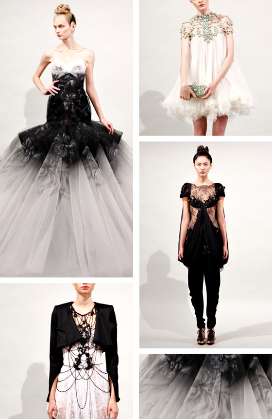
Like it or not - the royal wedding hype is upon us and growing exponentially as we approach tomorrow. I was looking forward to seeing the dress... and then I found these.

I feel mixed emotions every time I see a Marchesa collection. Fascination, awe, excitement, loss of breath (can that be counted as an emotion?), lust....
Then anger - because I fell so superficially into the trap of human consumerism.
Then it's back to awe... because I took another breath.

Sorry Kate, it's going to be hard to top these.

Monday, April 25, 2011

Drawing on rocks


There is something so calming, solid and peaceful about a rock. I love the surprising amount of weight a small pebble holds...and to think they have been formed and shaped from hundreds of years of weathering...what stories they must hold.

The smallest objects are sometimes the most fascinating.

Friday, March 25, 2011


i love photos that capture a lifestyle rather than just being a product shot... can you imagine wearing these tights on a Sunday morning in a loft style home, holding a cup of coffee in your hands and scanning the newspaper over a late breakfast of poached eggs on toast? 

get them here

Saturday, March 05, 2011

joan salo


I am mesmerised by the work of Joan Salo. How fantastic would it be to have a giant piece hanging in the dining room... i think i would just sit there and stare at it all day.

Friday, March 04, 2011

10 lessons for young designers


Weiden+Kennedy are one of the coolest ad agencies I can think of. I went to Semi-Permanent in Sydney a few years ago and heard 2 art directors from W+K Portland speak - their approach to coming up with ideas is so different from what is taught in a book! 

Having said that, I found these lessons from John C Jay, Executive Creative Director of W+K (pictured above), very interesting. Although some seem like common sense, it's nice to have a reminder from time to time.

My favourite is: "Travel as much as you can. It is a humbling and inspiring experience to learn just how much you don’t know."

Read them here.