Really nice project by Jose Guizar. Every week a different window is illustrated. Particularly love the colour palette. See the collection grow here.
Showing posts with label graphic design. Show all posts
Tuesday, March 12, 2013
Saturday, February 23, 2013
Handwritten
Last week I had the opportunity to hand ink 500 words for a Campaign Brief submission. It was immensely fun to do - I already feel rewarded for it. Who knew a page of text on word would equal over 1.6m (my height) of writing? :)
Labels:
getting out there,
graphic design,
littlemiso,
thoughts,
type
Thursday, August 23, 2012
Best wedding invite...
Design of the times... a microsite for a wedding invite! But totally drool worthy. Beautiful type, illustrations, story telling and serious parallax action.
Who else would it be created by, but the amazing Jessica Hische! (And Russ)
Check it out here - so worth it.
(Make sure it's on your computer not a mobile device).
Labels:
graphic design,
type,
website
Tuesday, October 11, 2011
Social Design
I've spent a good few hours reading this blog, which nowadays is virtually unheard of with our heavily image reliant, skim-reading tendencies when browsing the internet.
Andy Chen is a young (really, who am I calling young ><), insightful graphic designer interested in social design that writes remarkably well about his experiences, understandings and questions on design. If you're starting out in the design industry, I would recommend you read this insert on his internship at Pentagram. The feelings of inadequacy, realisation of learning and moments of joy when seeing your designs in public all ring a bell to what I have been through and sometimes still am going through.
This article on Design Observer written by Andy is also an interesting read: The Value of Empathy.
Gordon, Age 88
Social design has always been important to me, and I believe there is not enough focus on social design in Perth - through education or practice. Could it be because design is not as highly regarded or 'developed' in Perth, as compared to say, London?
Only when I studied for six months in London did I really understand the power of design - that design can change the way we behave (for the better), and bring attention to minority groups. Visiting places such as The Design Museum and learning of initiatives such as Design Out Crime made me realise how design as a practice could influence the world - rather than just how design could be used to increase brand equity.
The design briefs we received were a mix of difficult briefs tackling social issues as well as the typical graphic design briefs. I took one of these briefs back to Australia with me and completed it in my graphic design elective at Curtin. The brief required students to design a piece of communication to benefit older people experience, or vulnerable to, social isolation and loneliness.
My solution was a book of answers to the question; "What do you want to do in the future?" to raise awareness of the aspirations older people have.
I asked older people (aged over 60) and children (aged 7 - 12) to write down their answers, and found similarities between the two. I typographically arranged each aspiration and alternately placed the aspiration of older and younger people, in hope to highlight the similarities between the two and signify life as one passage, that each stage of life is not more important or less important than the next.
Valerie, Age 67
Anastasia, Age 8
Excerpts from 'Action for Age' project, 2008.
Although I am happy with the type executions and enjoyed exploring different media, in hindsight the solution was heavily dominated by aesthetics and lacked a unified message or call to action. That's not to say it's wrong - just that I would do it differently now.
Designing for change is something I've neglected in the past year or so, having been too absorbed in work, littlemiso and other commitments. It's something I would like to pick up again - because if tomorrow was my last day in on Earth, I would want to make a genuine difference in somebody's life.
Labels:
graphic design,
thoughts
Wednesday, September 28, 2011
VISH!
I am LOVING the art direction / styling / graphic treatment in the latest collection by VISH!, hand drawn patterns and nicely matched colours always get me ;)
Labels:
fashion,
graphic design,
styling
Wednesday, August 24, 2011
You Are The Map Maker
This is one of the best books I've read all year, and I am so excited to share this with you.
'You Are The Map Maker' is a project by Bernadette Jiwa, bringing together insights from 13 of the most creative and resourceful entrepreneurs on the planet. Jessica Hische, David Airey, Mark Bloom and Chris Guillebeau are just some of the creatives who have contributed their stories and their advice.
Starting up littlemiso and working as a freelance designer is one of my happiest achievements, but the reality is that it is not easy at all - and sometimes the smallest hurdle is enough to fill you with self doubt and slowly etch away your confidence to be a 'creative'. How many times have I started a project and not gone through with it because I didn't think it would work? Or even worse - I can't even count how many times I've had an idea in my head and thought it was brilliant, but never made it into a reality because of that tiny inkling of self doubt that eats away at my confidence. (Is it really worth spending $X on it? Is it really worth all that time?)
Reading these insights from successful creatives is a reminder that every hurdle I have been through or am going through is exactly what they have experienced through their journey - and through honesty, self reflection and persistence - they have gotten through to where they are now. Sounds like common sense, but when you're in these situations - it's the best type of advice you can get…and it's DESIGN related.
Working in a creative field is always going to be different in a bank or engineering firm. This book is filled with advice from designers we look up to, have the same mindset and similar likes and dislikes.
Now enough love for the book - just GO READ IT. For FREE.
Labels:
Books,
getting out there,
graphic design,
inspiration,
thoughts
Tuesday, August 16, 2011
Handwritten typography
Watercolour and typography combined - what more could I ask for?
Perfectly precise ink letters and intricately drawn pen letters by Sasha Prood - 'Designer, illustrator, artist and devotee of all things paper', currently working from Brooklyn, New York.
Her portfolio shows an amazing amount of patience, dedication and talent, and has worked with clients such as J.Crew, Juicy Couture and WIRED Magazine UK. But there's definitely more to come - she's attending Type@Cooper to further develop her typographic skills. One to watch!
Labels:
graphic design,
illustration,
type
Tuesday, June 28, 2011
Business Cards
Received my new business cards in the post last week - and I'm pretty happy with the letterpress! I was worried the fine strokes wouldn't come through, but they turned out fine. Now, what to do with 500? Who wants one?!
Labels:
graphic design,
littlemiso
Friday, June 10, 2011
Allison Colpoys
There is the most amazing interview on The Design Files today on Allison Colpoys, Penguin Book Designer.
Beautiful layouts, perfect typography and just the right amount of illustrated touches - I'm so happy to have been introduced to her work.
Definitely worth checking out.
Labels:
graphic design
Monday, June 06, 2011
Peppermint Milk
I have just finished the branding for the most delectable pastel delight ever - Peppermint Milk. Created by the lovely Maevana Mitchell, the label is filled with soft pastels, scalloped edges, florals, bows and lace. Even the coat hangers are pastels!
Maevana's main inspiration for the label is Marie Antoinette, from floral fabrics, frilly edges to intricate and ornate detail.
These shots were taken at her pop up shop last weekend, titled 'The First Breath', held in conjunction with talented photographer Libby Edwards - who has some seriously nice double (triple?) exposure photos.
Labels:
fashion,
graphic design,
littlemiso
Thursday, May 26, 2011
hello sandwich zine
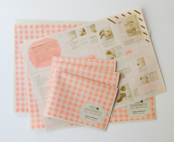
this hello sandwich zine is pretty clever stuff, the back of the zine is a fluro orange gingham which can be used for wrapping after! Pretty, functional and represents hello sandwich oh so very well :)
Check out the Gift Wrapping Zine here toooooo
Labels:
cute,
graphic design,
pretty,
wrapping paper
Monday, March 07, 2011
Subscribe to:
Posts (Atom)